What rooms suit Whirlwind?
The scenario note describes plausible uses based on its lightness, family, and undertone. It is planning guidance, not a guarantee for a particular exposure or set of finishes.
PPG color reference
#BEC0C2
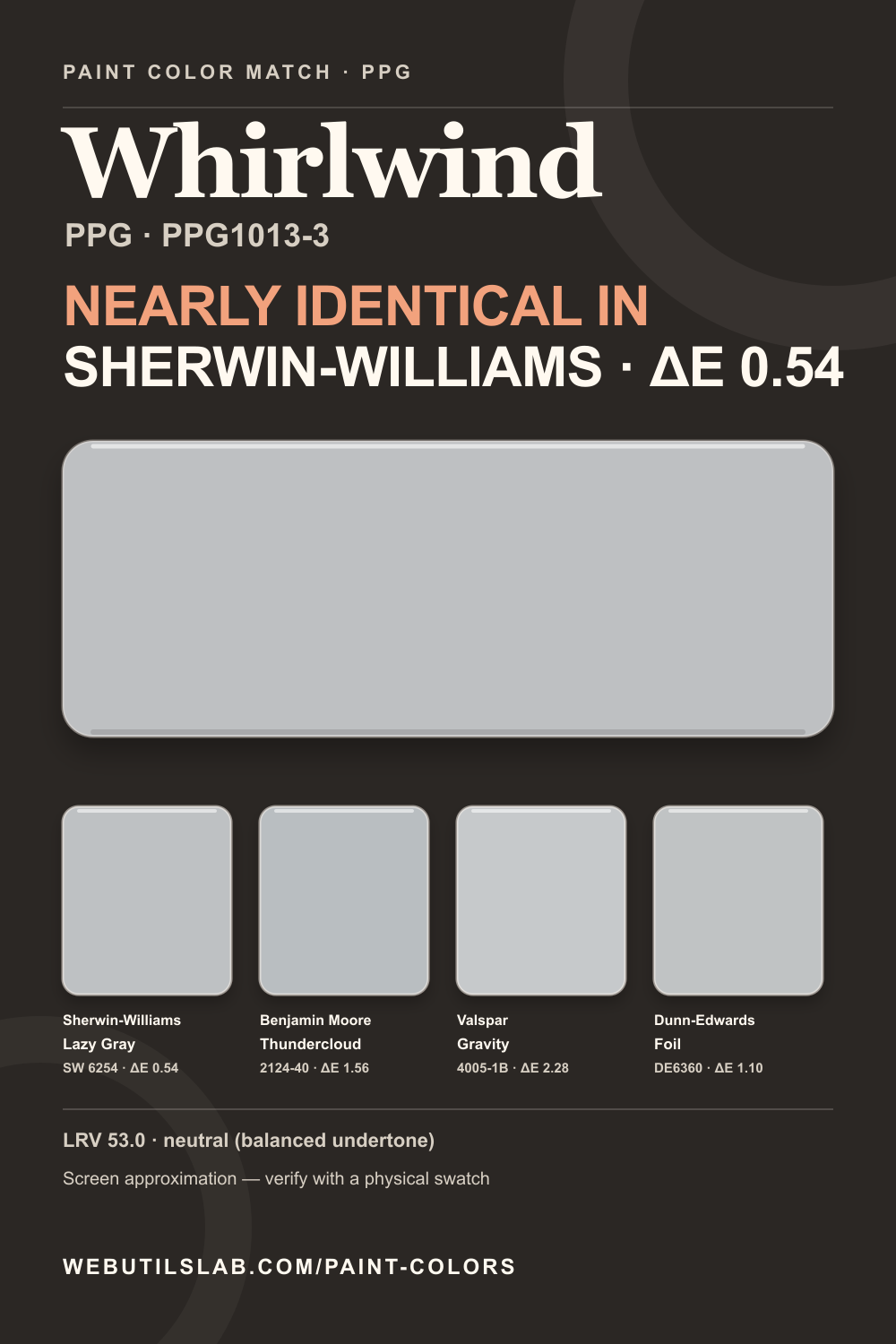
Compare this color across brandsA neutral screen color with a neutral (balanced undertone) reading and LRV 53.0. Not sure it's the exact color your local store carries? Here's the closest match at each of the other four brands.
In a room
Whirlwind is a balanced medium neutral that can organize a busy family room, office, or kitchen without pulling the scheme strongly warm or cool. Its moderate lightness allows white cabinets and trim to stand out. Large colored furnishings may influence how it reads, so judge it with the room assembled rather than empty. Move a sample board between sun, shade, and evening light to confirm that its calm character survives every important exposure.
Not affiliated with any paint brand. On-screen colors are approximations computed from the brand's published values; verify with a physical swatch.
Cross-brand shortlist
Lower ΔE2000 values are closer screen approximations. They are not paint-formula conversions.
Within PPG
Provenance
Saveable reference
FAQ
The scenario note describes plausible uses based on its lightness, family, and undertone. It is planning guidance, not a guarantee for a particular exposure or set of finishes.
Lamp color temperature and surrounding surfaces change adaptation and reflected light. Review a real sample under the lighting that will actually be used after dark.
The source and retrieval date are listed below. Paint libraries can change, so confirm the current code and technical data with the manufacturer or retailer before purchase. In this library, the nearest cross-brand screen value is Lazy Gray SW 6254 by Sherwin-Williams at ΔE 0.543.
Continue comparing