What rooms suit Porpoise?
The scenario note describes plausible uses based on its lightness, family, and undertone. It is planning guidance, not a guarantee for a particular exposure or set of finishes.
Dunn-Edwards color reference
#DBDBDA
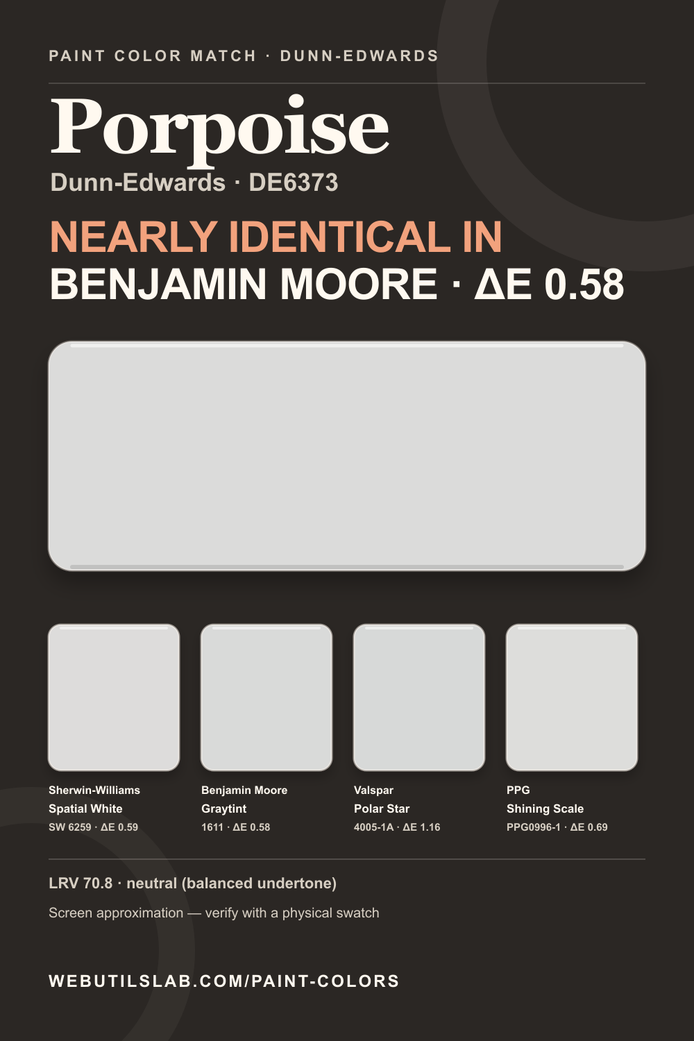
Compare this color across brandsA neutral screen color with a neutral (balanced undertone) reading and LRV 70.8. Not sure it's the exact color your local store carries? Here's the closest match at each of the other four brands.
In a room
Porpoise is a light balanced neutral that can make a nursery, home office, or casual living room feel settled without imposing a strong warm or cool theme. It leaves space for colorful textiles and artwork, yet remains distinct from crisp trim. Because nearby surfaces can steer a balanced gray, sample it alongside the largest rug and sofa. Check shaded corners after sunset to ensure the walls retain enough definition under the room's actual lamps.
Not affiliated with any paint brand. On-screen colors are approximations compiled from public references; verify with a physical swatch.
Cross-brand shortlist
Lower ΔE2000 values are closer screen approximations. They are not paint-formula conversions.
Within Dunn-Edwards
Provenance
Saveable reference
FAQ
The scenario note describes plausible uses based on its lightness, family, and undertone. It is planning guidance, not a guarantee for a particular exposure or set of finishes.
Lamp color temperature and surrounding surfaces change adaptation and reflected light. Review a real sample under the lighting that will actually be used after dark.
The source and retrieval date are listed below. Paint libraries can change, so confirm the current code and technical data with the manufacturer or retailer before purchase. In this library, the nearest cross-brand screen value is Graytint 1611 by Benjamin Moore at ΔE 0.583.
Continue comparing
All Dunn-Edwards references Open this color in the match tool